(This is an archived old post from the previous version of the page.)
In games that are all about immersion and believability of their worlds, what should we focus on during the creation of these worlds?
Let’s start with a disclaimer: what I write about below is merely a hypothesis. I do believe this is the right way to approach the problem, and I have researched this a lot – but still, it’s not exactly a proven thing.
Here’s the rule I propose:
The convincing, immersive game world needs to be indifferent to the player and the player needs to feel like an intruder.
Take a look at this bit from Call of Duty: Ghosts.
It’s all very spectacular, very pretty, and very ineffective in building a convincing world. Gamers can smell the script from a mile away. It actually came to the point that whenever you climb a ladder in a video game you expect two fighter jets passing by, and when you see a narrow path, you know that it will end with a spectacular vista reveal.
Guilty as charged, here is Bulletstorm:
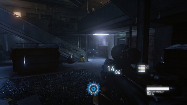
It’s not about just vistas, of course. Take a look at this screen from Syndicate:

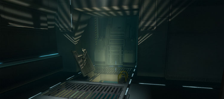
Or this one from F.E.A.R. 2:

Do you have any doubts where to go next? Not really, because the eye is drawn to the light. Does it make sense that there’s so much light in these spots? Not really, and the believability suffers.
Designers believe that leading the player subconsciously – for example, with the light – is the right way to go. The problem is, just as they can be led subconsciously, they can just as well subconsciously feel the fakeness of the world.
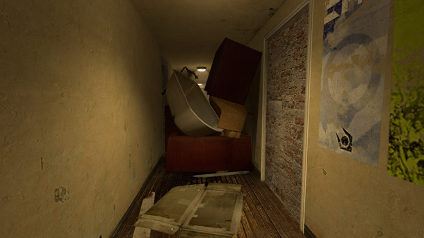
One more?

Again, gamers are smart. They know why this barrier exists. They know it’s not a natural part of the world, that it’s just a way to block off the rest of the world to save on time and resources, and to make sure that the players will not get lost even for a second – because apparently that would be a design crime.
Please note that so-called lazy barriers is a different problem. I am talking about “barriers done right”, i.e. ones that are convincingly impassable, but just so happen block every single path except the clearly pre-designed one.
Anyway, the above examples – the “accidental” vista reveals, the “invisible” guiding light, the “natural” barriers – are all building blocks of unconvincing game worlds, even if the players do not register the problem consciously.
Someone might say that the answer is: subtlety. Go ahead, reveal vistas, guide the player and well, even open world games have to have some limits – just do it in a subtle way. Be the invisible creator.
In a way …yes.
Yes, that’s definitely a step in the right direction. The Last of Us from Naughty Dog is a great example of the subtlety in world design. They used all the tricks of the trade; I assume, for example, that not many people realized that every important object you march towards is yellow (I didn’t). But it’s all done with such a mastery that this world feels the most real out of all post-apocalyptic games (unless you ask a S.T.A.L.K.E.R. fan).

But what if we went one step further? What if we created game worlds that totally did not give a damn, worlds that didn’t care about the player at all?
Why could this work?
It’s how the real world works, isn’t it? It’s weird that we model and texture our game objects so they perfectly mirror reality, but we’re not creating worlds that do. We nailed the details, but the big picture is still not quite there. Of course, 1:1 copy is hard and possibly unnecessary, but the core elements could remain: the odd structural mix of chaos and harmony of the real world, its indifference towards the inhabitants, etc.
But to me it goes a bit deeper than that, and I think that there are stronger emotions to evoke in the players if they feel like an intruder in the game world rather than a tourist.
It all starts with Adam and Eve and the forbidden fruit, of course. We just can’t help ourselves, can we? Remember all of these stories about a mysterious old house and the owner who warns his guests that they can go anywhere except into that one room? Yeah, we know how all such stories end. Sooner or later, someone goes into the room.
Also, I do believe there’s a little of a voyeur in every single one of us. It’s just human nature: the more we know, the easier it is to survive. Combine that, then, with our forbidden fruit weakness and suddenly the idea of a world in which we are an intruder – a voyeur gaining access to knowledge – makes a bit more sense. It’s simply …exciting.
Isn’t that one of the main reasons why people love open world games?
Aren’t things like that a wonderful experience in GTA, Skyrim, Red Dead Redemption? If you stop playing, the world does not stop with you, and that’s the “indifference” part. But watching the world being alive and finding your own way through the world is the “intruder” part.
Of course, emergent gameplay full of randomized scripts interacting with each other is very expensive to achieve. But that is not the only solution. Putting the player in awe through architecture is another. Didn’t you feel like an intruder in Dark Souls, ICO or Shadow of the Colossus – games that a lot of people consider the most immersive experiences of their lives?
And there are many other ways, of course. Including the really weird ones. In today’s post on our daily Tumblr I explain how we made Painkiller a pretty cool game despite the fact we had no idea how to properly make a game.
But heck, sometimes the greatness is achieved through …sloppiness.
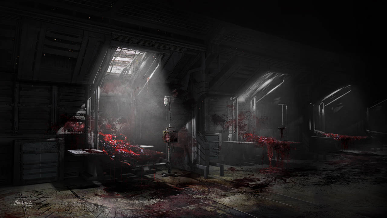
Dead Space is a good example. This game had such a bad level design, so full of backtracking and undefined connections that most people kept using the navigation tool every thirty seconds. On the surface level, that’s bad. But …didn’t that world feel …real? Weren’t the immersion and the sense of presence stronger in this supposedly awkward Dead Space 1 than in the streamlined, frictionless Dead Space 3?

Here’s an even better example. Nintendo 64’s Goldeneye, 1997. Here’s how Martin Hollis, the director of the game, explains the design of the game’s world:
The level creators, or architects were working without much level design, by which I mean often they had no player start points or exits in mind. Certainly they didn’t think about enemy positions or object positions. Their job was simply to produce an interesting space. After the levels were made, Dave or sometimes Duncan would be faced with filling them with objectives, enemies, and stuff. The benefit of this sloppy unplanned approach was that many of the levels in the game have a realistic and non-linear feel. There are rooms with no direct relevance to the level. There are multiple routes across the level. This is an anti-game design approach, frankly. It is inefficient because much of the level is unnecessary to the gameplay. But it contributes to a greater sense of freedom, and also realism. And in turn this sense of freedom and realism contributed enormously to the success of the game.
Goldeneye is a legend and sold over eight million copies. And it had nothing to do with it being a Bond game, as the sales of some other Bond games prove.
That’s not how most games are made today. Every square meter is sacred. The game world is first built in a whitebox form…

…and is tweaked and changed and redone until it satisfies the core gameplay loop. Only then the meshers jump in and change the whitebox into something supposedly real.
But at that point, everything is often so cold, so calculated, so predictable that the world stands no chance of being believable. It leaves no breathing room for the player’s imagination, and subconsciously hurts the sense of presence, and thus the immersion.
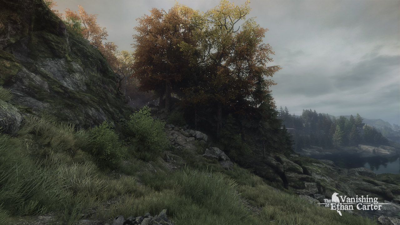
We believe in the intruder player meets the indifferent world approach to world design so much that we’re basically making The Vanishing of Ethan Carter a living, breathing example.
First, a lot of our environments are taken from the real life and put into to the game without the world bending to the player. For example, there are areas in which literally nothing happens. It’s just trees and rocks and grass, with nothing to find and no story beats to experience. It’s just you and the Red Creek Valley. And the valley is indifferent, disinterested, real.

Second, the player is also the intruder. Bad things happened in the valley, but it seems to be over now. The corpses are rotting in the blood-soaked ground, and the world is peaceful and quiet. But then you arrive, and you try to discover the truth and maybe save a life. And you poke, and you prod and you peek behind the curtain separating the world of the living from the world of the dead. You taste the forbidden fruit.
We have been making Ethan this way from the start, but why write about this now? This has appeared on the notgames blog a few days ago, and was the final trigger.

It is, indeed, a very good question, and I agree that every designer interested in immersive narrative experiences should know how their game answers this question. I hope this post helps a bit, even if purely as an inspiration for further discoveries in case this particular approach does not work for your game.

