(This is an archived old post from the previous version of the page.)
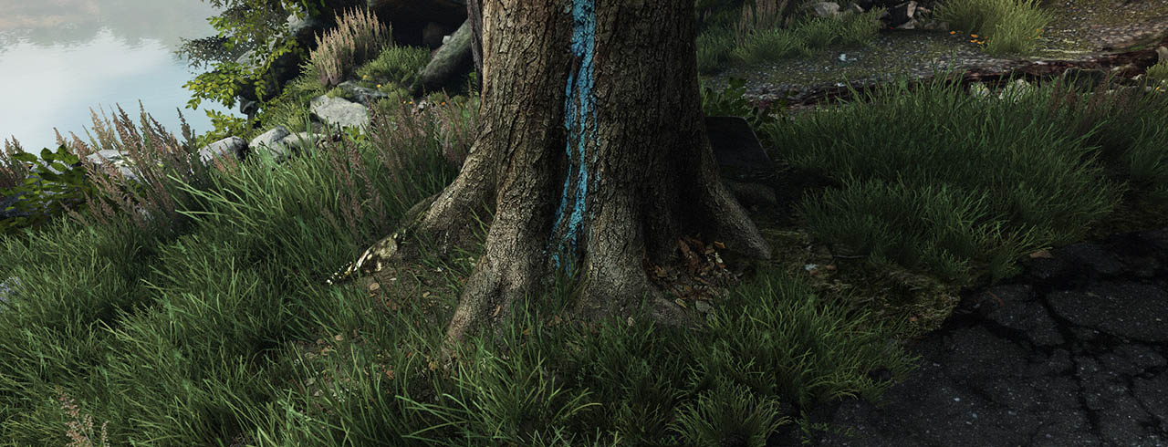
Good 3D foliage is hard. Well, it looks soft but in fact it is hard, as in, damn hard to achieve. Rendering subtlety, richness and dynamism of vast, wind-torn foliage by using just a bunch of flat, static triangles? One heck of a challenge. Luckily, we just love a good challenge.
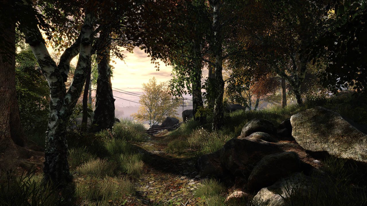
The vast majority of The Vanishing of Ethan Carter takes place outdoors, in the mountains, rich with overgrown forests and meadows. We knew we had to start with a lot of research. We analyzed tons of other games and their approach to foliage. We looked long and hard at work of classical painters, famous photographers and 3d artists. We basically downloaded all of the Internet.
We didn’t stop there, though. You see, we knew we wanted our environment as immersive as possible, and this means cohesion. Just because you find two plant photos on the same webpage doesn’t mean these plants grow next to each other in nature too. If you want to create a natural environment that makes sense and feels right, your best bet is to move your ass and get out there.

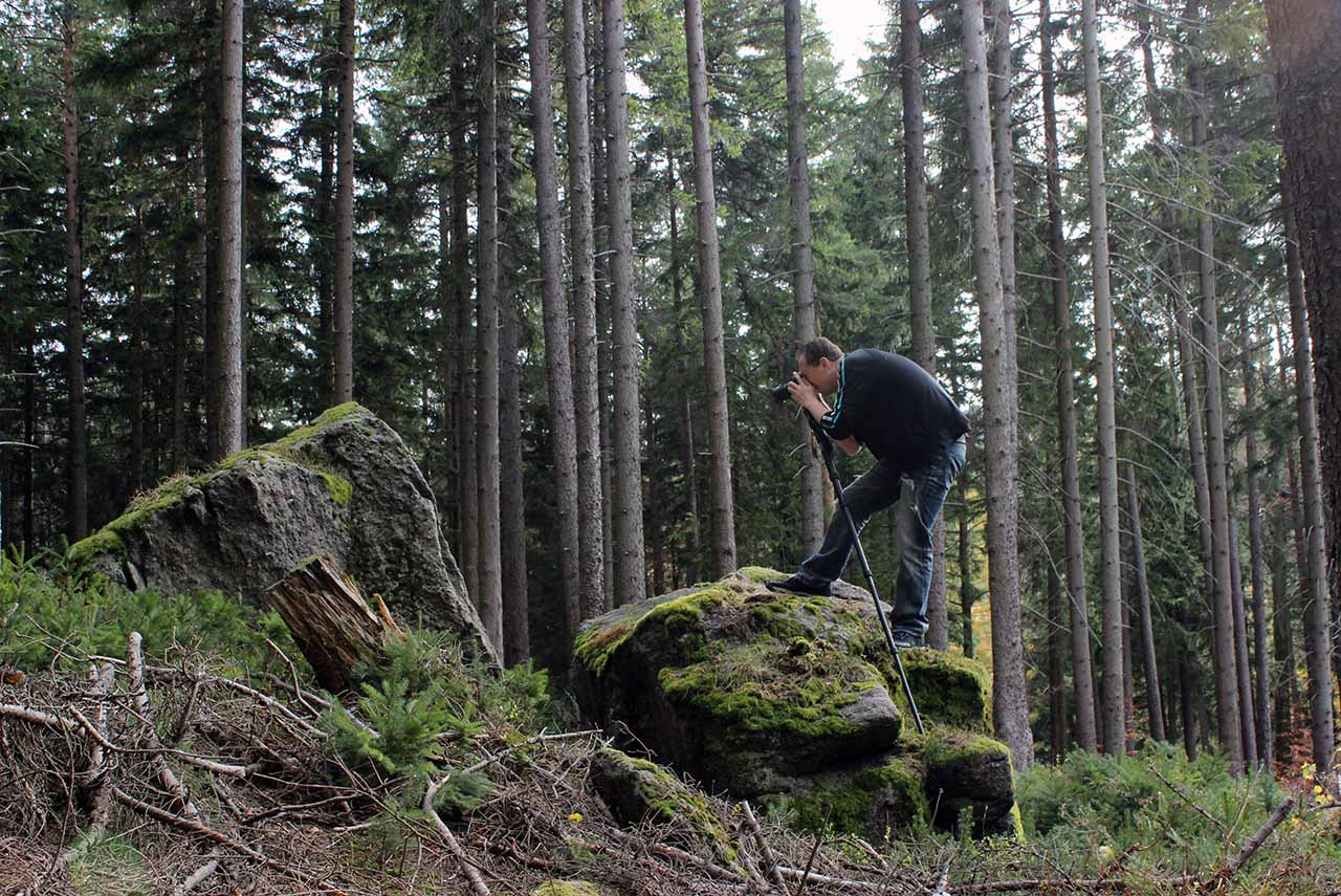
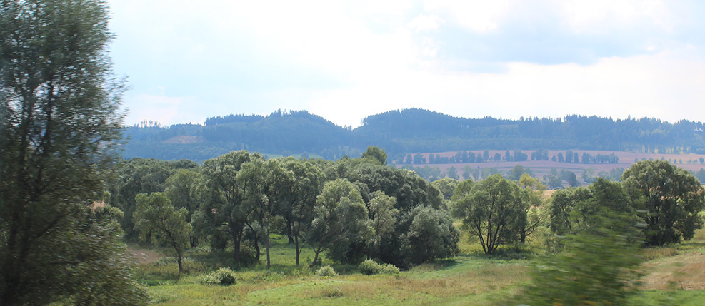
● We chose a real place, located in the heart of the beautiful Polish Karkonosze mountains. We traveled there four times, spent many exhausting days destroying boots, ripping clothes, and feeding mosquitoes. It was worth it, though. We photographed, analyzed and learned from actual environments. Before that trip we already had a pretty good idea what goes where and even made some test environments, but imagination just can’t beat the real thing. After seeing how mother nature does it, we deleted those tests and burned the drives.

● When you don’t follow references from mother nature, you often miss seemingly irrelevant details. You ignore nature’s order – vegetation in forests and meadows is anything BUT random! – and most often you cheat scale. Somehow, it’s super easy to get carried away with how nicely the screen fills up when you scale up grass models to 300% of their natural size. It helps the rendering performance in a big way, but there’s a limit to how much you can cheat the size before you lose believability.

● Rendering performance is an important concern for all types of real-time environments, but for foliage it is simply THE most important factor. If you go for bold, vast open landscapes like we did in The Vanishing of Ethan Carter, you need to render literally millions of leaves, blades of grass, stems, branches, flower petals, etc. – all that in just a few milliseconds, every frame. Choose less suitable method of building foliage for your game and the framerate drops down to a crawl.
Michal spent the entire 2013 working almost exclusively on foliage, experimenting with different kinds of trickery, building countless versions of grass and trees. He went through almost every imaginable method, from billboards (flat grass planes that always rotate to face you, so you never see the flatness), all the way to painting the grass using particle effects! In the end, he was able to merge a few different methods into one smart hybrid solution that looks great and runs even better. Thanks to that, our grass does not need to appear magically in the five metre circle around the player and we don’t need to avoid large areas with huge draw distances.
● We used a lot of actual plant photographs as textures but we also created many plant elements from scratch. A lot of times that hard manual work gave us better looking and “more optimal” results than if we depended entirely on pure photo-driven realism. For animation, we turned to smart tricks through the use of vertex shaders. Our plants are all actually static objects that sway in the wind by offsetting individual vertices while displaying those static objects.
No matter what the approach, your plants need to fake richness and complexity of shapes. They may look rich, realistic and very 3D while, in fact, they consist of a few flat triangles with a smart texture and smart shader. But this leads to another problem – when such flat triangle intersects with the ground geometry or other objects, it really shows.
This can’t be fixed but can be helped – we spent a lot of time carefully matching colors and patterns, even adding specialized shaders that adjust color and pattern of the ground textures when the player gets close enough to notice the intersection.

● Visual complexity and actual technical simplicity of the foliage (bunch of flat triangles, remember?) present another set of challenges – this time with lighting. In nature, a tree branch is very three dimensional with leaves facing the sun at different angles, overshadowed to a different degree by other leaves, some light partially blocked and scattered when traveling through leaves, etc. Very complex, very 3D.
When tree branches are simplified to just a few flat planes, you get large batches of leaves facing the light the same way, so again, we had to get real crafty. We distorted the geometry information to trick the lighting engine into thinking that those flat triangles are not flat, and we added a smart shader that mimics how leaves overshadow each other. We even added a shader that mimics how each leaf changes its orientation towards the sun as it trembles in the wind.
● The real work started when we got all of that out of the way. To use a metaphor – a painter got his references, his canvas, brushes and the paint ready. The time has come to use it all to make something beautiful. We started ‘painting’ the foliage, focusing a great deal on clear and strong composition and visual cohesion. Without that focus, we would end up with something detailed and realistic but visually noisy and uninteresting.
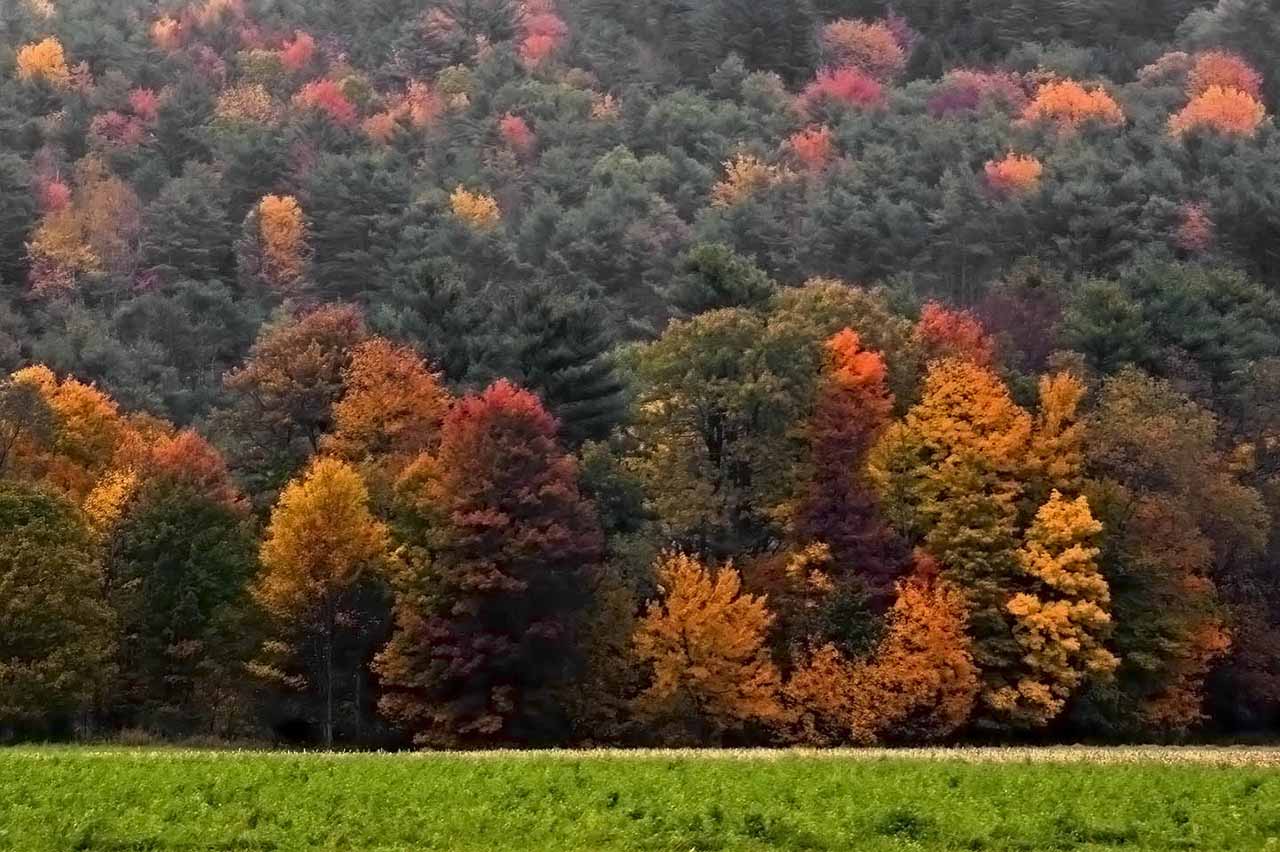
We actually had to dial down on some features – we gave up per pixel shadowing which produced too crisp and too noisy shadows, and we also disabled Ambient Occlusion on a lot of plants because the dark contours it produces made individual plants or even branches ‘pop’ instead of blending nicely. We even reduced some real-life autumn-related variation in color — sometimes mother nature is too crazy to be believable.

● Creating a nice visual flow of the foliage, using it to attract the player’s eye in all the right directions, adding contrast and standout features in focal key areas were the most important aspects of our work and allowed us to achieve foliage that is not only pretty realistic and pretty efficient but also pretty pretty. Or so we like to think – you’ll be the judge.

P.S. Extra info in our dev diary on Tumblr: Ethan Carter, Karkonosze and Wisconsin.
