(This is an archived old post from the previous version of the page.)
We’ve crowdsourced our logo, because the Internet claimed it was a good idea, and we believe everything that’s on the Internet. We were promised that in about a week we’d get dozens of designs. That was not a lie. We did get dozens of designs. Most of them like this:

We’re exaggerating, of course, but not as much as you think.
Point is, we started to question our Google skills.
But then one day this happened:

And we fell in love.
Before you read any further, think about your initial reaction to the logo. If you didn’t like it, well, not much we can do about it. But if you liked it, why?
For us, there were three major reasons, and a bonus one.
First, the font chosen and the graphic element both ooze modernized, simplified retro sci-fi. The first name that springs to mind is Jules Verne, the writer of such classics as A Journey to the Center of the Earth, Twenty Thousand Leagues Under the Sea, and Around the World in Eighty Days (and apparently a man not afraid of long book titles). We’ve read these books as kids, and we believe that not many authors can spark the imagination like Verne.
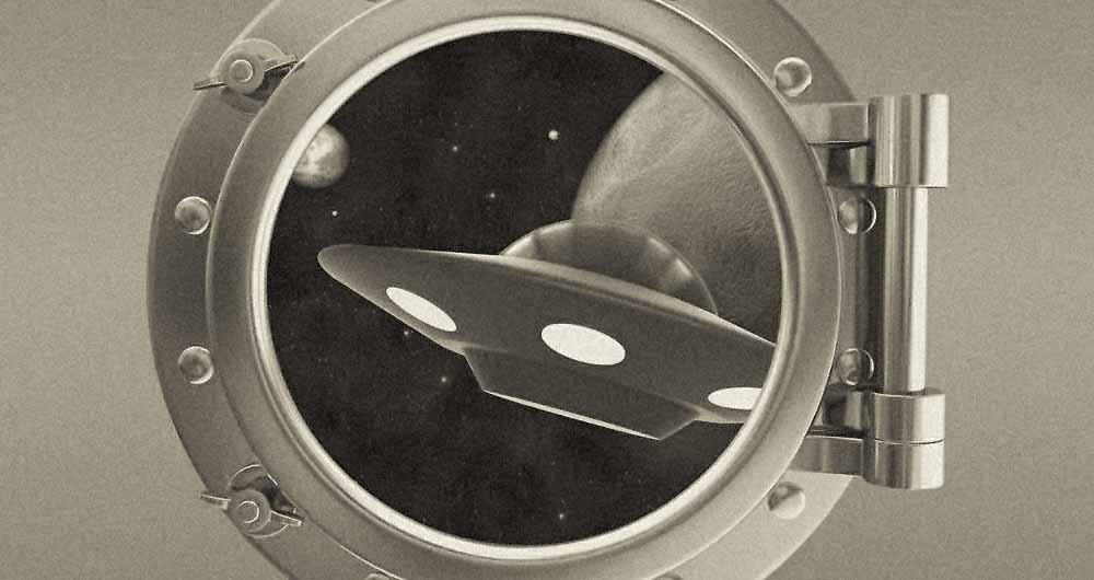
Second, the graphic element that replaces the ‘O’ is a small round spaceship window – not unlike the ones you see in old marine vessels = through which we can see the cosmos. What does that part of our logo show exactly? Is it the Earth and the Moon? Is it our sun and the Earth? Is it the Earth as seen from behind Venus? Or is a completely different galaxy? We don’t know, and that’s what’s great about it.
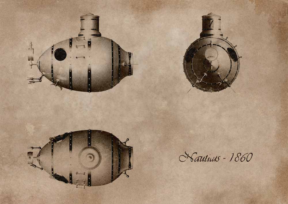
Third, if you blur the logo and look at the outline, it will be in the shape of a steampunk submarine. Which is awesome. At least that’s what we see. Or it’s a Minecraft character riding in a limo cabriolet or a barrel of a rifle the end of which just exploded. We don’t know really, we’re making this up as we go.

Bonus? The spaceship window allows us to have a cool Twitter and Facebook icon. Whether we like it or not – and we do, because we like people – it’s important to have a recognizable icon.
The only moments when we have our doubts is when we look at the Comic Sans logo at the top of this post and wonder if it wasn’t a bit more memorable. It certainly makes an impression.